OUGD401, Context of Practice, has introduced me to a higher, more comprehensive level of practical investigation than that which I had experienced before starting the course. The module has provided me with the knowledge and skills required to demonstrate a particular thesis via practical design practice and academic writing respectively.
Through context of practice I have been able to experience new approaches to academic writing, such a triangulation, allowing me to develop my writing skills and competence as an aspiring designer through the ability to recognise and investigate the considerations and perspectives of industry practitioners who have years of experience and extensive knowledge.
The question I selected to investigate and practically investigate was that which was concerned with the relationship between brands and consumers. Branding has been a key interest of mine regarding the field of design for some time, though the module has taught me that there is so much more to a brand than the logo they use to represent themselves. The strategies they use are equally, if not more so, important than simply the visual the consumer associates with them. It is through brand strategy that specific aims and ambitions are able to be achieved by a company.
The practical investigation I undertook used the notion of 'sports luxe' as an example of brands' ability to manifest themselves into sub-brands and new sectors of popular culture and social presence. I exploited the brand strategies used by sports brand Adidas to re-brand Lululemon Athletica, a yoga/active apparel company surrounded by controversy and visual irrelevancy. Through this I was able to create "Asana Athleisure,' an altogether more relevant, considered and sector specific branding system.
Context of Practice supplied me with the opportunity to collaborate with students from outside the college as I enlisted the help of a fashion promotion student from Ravensbourne University, London, to style in a photoshoot and assist with creative direction. This allowed me to experience one of the many strategies used by Adidas first hand - undoubtedly proving the enhanced prospects of a brief when collaborative practices are utilised.
Though the breadth of knowledge I have gained throughout the module is yet to be paralleled, I believe the investigation I carried out may have been aided by more primary research - excluding just feedback from critiques. This is something I will ensure is at the forefront of my considerations in the future.
Showing posts with label OUGD401. Show all posts
Showing posts with label OUGD401. Show all posts
Sunday, April 24, 2016
Wednesday, April 20, 2016
Asana Athleisure Collateral: Promotional Posters / Billboard Concepts.
In addition the the collaborative collateral Asana Athleisure x Adidas Sports Luxe Collection look book, I also produced billboard mock-ups to demonstrate how the collection may be promoted using the identities of both brands alongside the photographs taken to evidence the trend. These are evidenced below:


Sunday, April 17, 2016
Asana Athleisure Collateral: Collaborative Look Book
In a final attempt to demonstrate the how the Adidas brand strategies can be used to achieve a successful brand and to show the sports luxe collateral images in context, I have produced a look book concerned with a collaboration between Asana Athleisure and Adidas.

The look book focuses solely on the photographs as they speak for themselves; they demonstrate the sports luxe trend, the clothes that would be sold by the brands in collaboration and introduce the new Asana Athleisure identity.
On of the most notable strategies used consistently by Adidas is collaboration, celebrity endorsement and an ever-expanding brand portfolio, enabling them to form a strong connection to the consumer. The company aims to be ‘The first sports company that invites athletes, consumers and partners to be part of its brands’ (Liedtke, E. 2015). This collaborative approach to business — evidenced through campaigns including major high-street fashion retailer Topshop via the ‘Topshop x Adidas Originals’ collection, acclaimed British fashion designer Stella McCartney via the ‘Adidas by Stella McCartney’ collection as well as British singer Rita Ora’s collection ‘Adidas Originals by Rita Ora’— allow the brand to permeate every aspect of popular culture. By applying this collaborative direction to the Asana Athleisure brand, there would be enhanced awareness of the new brand and therefore a greater success.
The look book focuses solely on the photographs as they speak for themselves; they demonstrate the sports luxe trend, the clothes that would be sold by the brands in collaboration and introduce the new Asana Athleisure identity.
Saturday, April 16, 2016
Asana Athleisure Final Logo

The Sanskrit language-founded brand name 'Asana Athleisure' and its concern with balance and strengthening of the body and mind provide a perfect representation of what yoga and an active lifestyle supply to the consumer through a short, direct and easily pronounceable word - appropriately reflective of the company's specific sector and specialism. The word Asana will be accepted as common knowledge to those who take part in the activity of yoga and will therefore be provided with a direct indication of what the brand provides, whilst also being an uncommon word that would provoke interest to those new to the brand and promoted lifestyle. The addition of Athleisure helps to establish ease of identification of the company as a sports brand that provides sport apparel and active wear for running and other physical activities besides yoga via contemporary language founded through the sports luxe trend. The term athleisure is used to describe apparel that is both athletic in purpose, stylish in aesthetic - this being what the brand provides. The alliterative quality of the combination of these words also makes for a more distinct, memorable brand name.
The typeface communicating the brand name, Futura Bold, has enhanced prominence for purposes of legibility, allowing the the word make to be identified with ease even at small scales and further distances. This geometrically-founded typeface is well-balanced, free of complication and unnecessary additions. It's geometric aesthetic is representative of the shapes and forms of the body and its flexibility, abilities needed to perform yoga and active/physical exercise - therefore making it relevant to the brand and its contexts. The lower-case quality of the word mark signifies the calming practice of yoga as an activity, whilst also being considered a contemporary trend (as sports luxe is also). The brand name is optically kerned with a standard leading to ensure maximum readability.
The word mark is not dissimilar in style to the swiss, sans-serif, lower-case typestyle used by Adidas which was in emergence in the nineteen-twenties in Russia, The Netherlands and Germany when Adolf Dassler began registering his ventures. The bold, modern aesthetic has served the company great purpose in establishing a timeless brand that has remained and maintained a current, contemporary identity despite the time that has passed since its creation, and therefore the treatment supplied to the Asana Athleisure resolution has the potential to be met with the same regard thanks to this strategic approach.
The accompanying symbol to the Asana Athleisure word mark is also inspired by the strategic effort made by Adidas that has enabled them to create more memorable, distinctive and captivating brand representations that ensure longevity; there is nothing ephemeral about any of the Adidas logos.
The Asana logo visually represents the brand name via an upper case 'A' that instead of a cross bar has a singular circle in the centre. As with the word 'Asana' (movements designed to help find balance, purify and strengthening the mind and body through opening of the energy channels), the symbol signifies the finding of a centre balance and the strength and form of the body through the strong, bold structural lines and centre circle.
As well as acting as a visual representation of the brand name, the symbol also subtly exhibits a compositional similarity to the body when finding a centre balance in yoga with the structural lines being the arms above, and centre circle the head. This, similarly to Adidas' symbols, provides the logo with enhanced contextual significance via representational forms and shapes that in turn aid the consumers perceptual receival through an enriched understanding of meaning and company values, foundations and ambitions. This also evidences Wally Olins, Debbie Millman, Douglas. B Holt and
Steven Miles' view that brands are representative of identity.
The intentional monochromatic/black and white quality of the logo as a whole uses the Adidas visual strategy to provide the brand with adaptability, timelessness and a tonal contrast that creates both distinct impact and an effortless demeanour.
Tuesday, April 12, 2016
Asana Athleisure Collateral Sports Luxe Images: Critique and Final Selection.
Today I brought the short-listed Sports Luxe collateral images to critique to identify those which people feel are the most effective and the setting/point of delivery through which they should be delivered.
I first asked the critique group to each mark their favourite 5. The results of this are documented below (images that were marked):
Further critique questions:
1. Where would you like to see these images used/in what context?
I first asked the critique group to each mark their favourite 5. The results of this are documented below (images that were marked):
 |
| 1 Mark |
 |
| 1 Mark |
 |
| 3 Marks |
 |
| 9 Marks |
 |
| 1 Mark |
 |
| 8 Marks |
 |
| 6 Marks |
Further critique questions:
1. Where would you like to see these images used/in what context?
- I imagine them on billboards.
- Very suited to editorial, so magazine/look book. Billboards too.
- Would work very well within a purely photographic look book.
- I would use as advertising pieces/on a billboard.
- Editorial setting.
- Billboard.
- Look book.
- Editorial.
2. Additional Comments:
- Really professional photos, convey the 'sports luxe' really well - especially love the photos of the girl in front of the blue background - very editorial.
- Very well executed and professional. The urban block coloured walls/concrete suit the urban sport luxe because they're in an editorial-looking location.
- Professional and well-shot/styled. I feel the like the images are also really flexible and could be used across different formats.
- They look professional and high quality and all images can be used to answer your question.
- Good use of location.
- Really like the photos. The colours contrast well with the model and her clothing. Very professional.
Wednesday, April 6, 2016
Asana Athleisure Collateral Sports Luxe Images - Shortlisted.
Yesterday the collateral Sports Luxe photoshoot took place. These images, which focus on the sports luxe fashion trend, were shot on location within a sporty environment to achieve lifestyle driven images that would in-turn make Asana Atheleisure a more desirable brand.
Collaborating with Ravensbourne University (London) Fashion Promotion student Danielle Bruce as stylist, we were able to ensure these collateral sports luxe images best reflect the trend, style and aesthetic effectively and successfully thanks to her extensively informed understanding of the trend and fashion styling in general.
Speaking of the images achieved, Danielle had this to say about the success of the shoot:
'Through the forward planning of outfit changes, looks and setting/environment before shoot day, we were able to capture a wide range of shots that allowed the style of sports luxe to be represented in different ways. As sports luxe is such a unique trend that expresses the power and freedom that sporting activities bring to an individual, the art direction of dominating poses and angles allowed the confidence of the styling to create inspirational, powerful fashion imagery. The clean makeup and lines of the images allowed the model to have a dominating presence in a distracting environment, that overall made the images successful within an editorial sense through the clear visual hierarchy and consideration of focused shots.'
Below are the images Danielle and myself feel best reflect the trend, its context and the way in which it should be carried.


Friday, April 1, 2016
Sports Luxe Photoshoot // Stylist and Shoot Planning
In a previous critique I received feedback that images for an editorial shoot focusing on the sports luxe fashion trend should be shot on location to achieve lifestyle driven images that would in-turn make for a more desirable brand. In order to ensure these collateral sports luxe images to be taken best reflect the trend, style and aesthetic effectively and successfully I have decided to collaborate with a stylist who has an extensively informed understanding of the trend and fashion styling in general.
Danielle Bruce is a 19 year old Fashion Promotion student studying at Ravensbourne University, London. She has been following the sports luxe trend since its emergence in 2014 and is knowledgable in appropriate garments, accessories and accompanying hair and make-up styles. She will be stylist on the shoot and joint creative director alongside myself.
Stylist Comment:
Location
The images will be taken within a sports ground environment, where photos will be composed in the stands and in the seating areas of the stadium. The sporty aesthetic and strong architectural elements and visual information of the stands will enhance the sporting environment and sport luxe style of the shoot. By considering the shots and the way a unique perspective can be created the aim of the location is to enhance the sports luxe focus whilst enhancing contextual reference and direction.
Styling
When considering the styling of the shoot, a variety of shapes and tones have considered - concerned with as to whether they will compliment the models appearance, location and style of the shoot. By considering the importance of tones and textures of garments, the appearance of clothing for the shoot will have an energy within itself, through contrasting tones and textures enhancing the trends and how sports luxe can enter the mainstream fashion market in a youthful and engaging manner.
Look Concepts/Planning
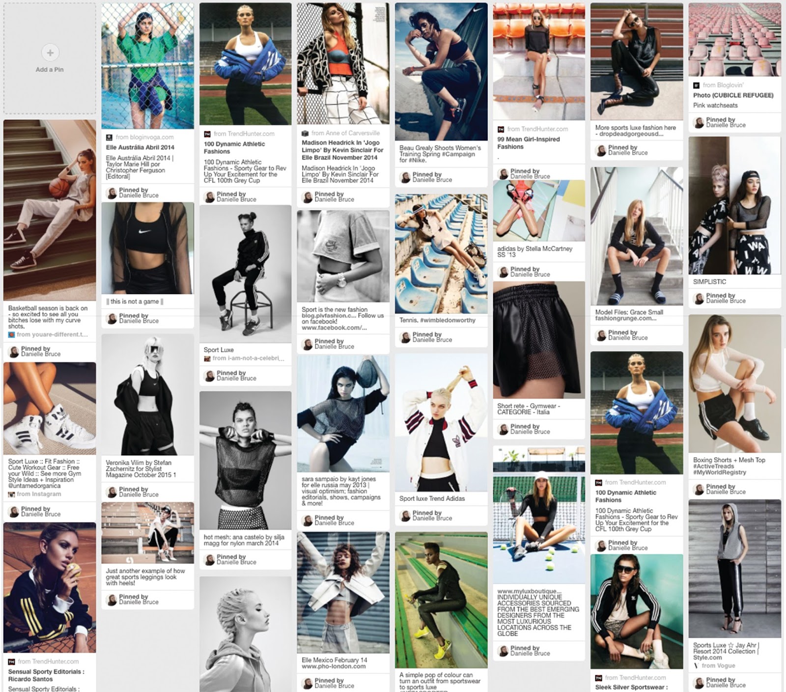
Before devising potential looks for the shoot, Danielle created an extensive pinterest board of images to supply inspiration and potential direction for the shoot. These, followed by potential looks, are exhibited below:


Danielle Bruce is a 19 year old Fashion Promotion student studying at Ravensbourne University, London. She has been following the sports luxe trend since its emergence in 2014 and is knowledgable in appropriate garments, accessories and accompanying hair and make-up styles. She will be stylist on the shoot and joint creative director alongside myself.
Stylist Comment:
Location
The images will be taken within a sports ground environment, where photos will be composed in the stands and in the seating areas of the stadium. The sporty aesthetic and strong architectural elements and visual information of the stands will enhance the sporting environment and sport luxe style of the shoot. By considering the shots and the way a unique perspective can be created the aim of the location is to enhance the sports luxe focus whilst enhancing contextual reference and direction.
Styling
When considering the styling of the shoot, a variety of shapes and tones have considered - concerned with as to whether they will compliment the models appearance, location and style of the shoot. By considering the importance of tones and textures of garments, the appearance of clothing for the shoot will have an energy within itself, through contrasting tones and textures enhancing the trends and how sports luxe can enter the mainstream fashion market in a youthful and engaging manner.
Look Concepts/Planning
Before devising potential looks for the shoot, Danielle created an extensive pinterest board of images to supply inspiration and potential direction for the shoot. These, followed by potential looks, are exhibited below:

The shoot will take place on Tuesday 5th April 2016.
Concept: Sports Luxe
Creative Direction: Myself / Danielle Bruce
Stylist: Danielle Bruce
Photographer: Myself
Model: Georgie Smith
Location: Castle Park - Doncaster Rugby Club

Saturday, March 12, 2016
Asana Athleisure Symbol

Above is the symbol I have designed to accompany the Asana Athleisure word mark. The addition of a symbol is a strategic effort also made by Adidas that has enabled them to create more memorable, distinctive and captivating brand representations that ensure longevity; there is nothing ephemeral about any of the Adidas logos.
The logo visually represents the brand name Asana via an upper case 'A' that instead of a cross bar has a singular circle in the centre. As with the word 'Asana' (movements designed to help find balance, purify and strengthening the mind and body through opening of the energy channels), the symbol signifies the finding of a centre balance and the strength and form of the body through the strong, bold structural lines and centre circle.
As well as acting as a visual representation of the brand name, the symbol also subtly exhibits a compositional similarity to the body when finding a centre balance in yoga with the structural lines being the arms, and centre circle the head. This provides the symbol with enhanced contextual significance via representational forms and shapes that in turn aid the consumers perceptual receival through an enriched understanding of meaning and company values, foundations and ambitions.

Tuesday, March 8, 2016
Asana Athleisure Typography / Wordmark

The above image evidences an exploration into all lower-case, sans-serif typefaces communicating the brand name 'asana athleisure.' I have decided to explore only this style after evaluating the strategic success experienced by Adidas via the use of the swiss, sans-serif, lower-case typestyle used by the company. This typestyle was in emergence in the nineteen-twenties in Russia, The Netherlands and Germany when Adolf Dassler began registering his ventures. The bold, modern aesthetic has served the company great purpose in establishing a timeless brand that has remained and maintained a current, contemporary identity despite the time that has passed since its creation.
By following some of the same principles as Adidas when creating the Asana Athleisure branding, I believe I will be able to produce an effective logo that is also distinctive, timeless and contemporary.
The typeface I have selected for the re-brand is Futura, set in bold for enhanced prominence and purposes of legibility, allowing the the word make to be identified with ease even at small scales and further distances. This geometrically-founded typeface is well-balanced, free of complication and unnecessary additions. The geometric aesthetic of the typeface is representative of the shapes and forms of the body and its flexibility, abilities needed to perform yoga and active/physical exercise - therefore making it relevant to the brand and its contexts. The lower-case quality of the word mark signifies the calming practice of yoga as an activity, whilst also being considered a contemporary trend (as sports luxe is also). The brand name has been optically kerned with a standard leading to ensure maximum readability.

Sunday, March 6, 2016
Identifying New Name for Rebrand (with research).
With my proposal to use the notion of 'sports luxe' as an example of brands' ability to manifest themselves into sub-brands and new sectors of popular culture and social presence and exploit the brand strategies used by sports brand Adidas to re-brand Lululemon Athletica established, I must first generate a new name for the yoga/active apparel company.
The issue with the current name, aside from the numerous associated controversies, is that there is no contextual support or relevancy that gives consumers an indication of the company's sector of business, specialism within the apparel market or points of consumer identification / opportunity for resonation. Nothing about 'Lululemon' suggests a brand who's aim is to provide style-conscious specialist yoga and/or running wear for the active consumer. Considering this, I believe it is important to address this immediately.
In an attempt to provide the company with a considered, relevant and subject appropriate name, I looked to words associated with yoga - this being the primary focus of the brands apparel.
Preliminary research allowed me to identify 'Sanskrit,' the classical Indian language used in yoga to define poses and practices. This allowed me to explore and identify potential words of the language that had potential to become a part of the re-brand. Some of these are detailed below:
'Asana Athleisure.'
The issue with the current name, aside from the numerous associated controversies, is that there is no contextual support or relevancy that gives consumers an indication of the company's sector of business, specialism within the apparel market or points of consumer identification / opportunity for resonation. Nothing about 'Lululemon' suggests a brand who's aim is to provide style-conscious specialist yoga and/or running wear for the active consumer. Considering this, I believe it is important to address this immediately.
In an attempt to provide the company with a considered, relevant and subject appropriate name, I looked to words associated with yoga - this being the primary focus of the brands apparel.
Preliminary research allowed me to identify 'Sanskrit,' the classical Indian language used in yoga to define poses and practices. This allowed me to explore and identify potential words of the language that had potential to become a part of the re-brand. Some of these are detailed below:
- OM: a single-sound mantra that signifies the unification of the body, mind and spirit.
- PRANA: Life energy, life force, or life current.
- ASANA/ASANAS: Yoga Postures, Asanas are movements designed to help balance, purify and strengthening the mind and body through opening of the energy channels.
- CHAKRA: A centre of radiating life force or energy that is located between the base of the spinal column and the crown of the head. Sanskrit for 'wheels.'
- SADHAKA: This is a student who strives for a goal.
Immediately from the Sanskrit language I have explored, Asana is the word that is most prominent to me in both sound and relevancy to the brand. The word's concern with balance and strengthening of the body and mind provide a perfect representation of what yoga and an active lifestyle supply to the consumer through a short, direct and easily pronounceable word. A certainly more appropriate brand name that is appropriately reflective of the company's specific sector and specialism. Also, the word will be accepted as common knowledge to those who take part in the activity of yoga and will therefore be provided with a direct indication of what the brand provides, whilst also being an uncommon word that would provoke interest to those new to the brand and promoted lifestyle.
Whilst Asana may be the perfect word regarding brand relevancy, I feel that an additional word need to be provided to the brand name to further establish the company as one within the sport apparel sector providing active wear for running and other physical activities besides yoga. I believe Athleisure will help to establish ease of identification of the company as a sports brand via contemporary language founded through the sports luxe trend. The term athleisure is used to describe apparel that is both athletic in purpose, stylish in aesthetic - this being what the brand provides.
The alliterative quality of the combination of these words will also make for a more distinct, memorable brand name.
Rebranded Name:
'Asana Athleisure.'
Tuesday, March 1, 2016
Practical Investigation Proposal Critique
Question 1: Considering the current name, logo and associated controversies - do you believe the Lululemon rebrand should include a change in name?
- Yes, the current name doesn't sound like a sports company. A brand with this many issues could benefit from a complete name change.
- Yes, I think it is slightly unclear what the brand is, it maybe better to move away from the controversies.
- I like the athletica, perhaps remove the lululemon and produce and new visual.
- No, its an interesting and catchy name.
- Yes and no, companies run the risk of losing their brand identity and current consumers when a familiar name is changed, however in this circumstance it would give the company a fresh start to move away from the controversy.
- Yes I think in the case changing the name would greatly benefit and let the company start a new. Customers who are loyal to the brand would stay with the journey.
Question 2: As with Adidas, do you believe a strong associating visual is important in creating a more successful brand? Why?(as opposed to a purely typographic resolution).
- Yes, more versatile logo, more recognisable from a distance perhaps?
- Yes, especially if they sell clothing etc, more applicable.
- Definitely, effective logos stick in people's heads.
- Yes, make it simple. strong and effective.
- Yes, it means that a brand can be recognised without type and branding is less limited by size and scale.
- Visual within this particular line of selling, however unless this can be printed on clothing then type it will be your best option.
Question 3: If collateral material was to be produced, do you believe images for an editorial shoot focusing on the sports luxe fashion trend should be shot on location/lifestyle aesthetic or within a studio environment? Why?
- I like the lifestyle aesthetic, however these are much harder to shoot high quality/professional.
- Lifestyle shots can make a brand appear more desirable, but focusing on the garments means people are more informed when buying. Sometimes if people can't see how a certain thing looks it will put them off buying the product. Finding an industrial/urban looking backdrop would look great and lifestyle-like.
Question 4: Do you prefer the term 'athleisure' or 'sports luxe?'
- Sports luxe sounds more high-end, athleisure more practical.
- Sports luxe.
- Sports luxe sounds more fashion-y whereas athleisure sounds more casual.
- Sports luxe really hammers the idea of a premium brand.
- Sports luxe sounds like sportswear specifically made to a high quality and fashionable.
- A change in name for the brand is a necessity in moving past the controversies experienced.
- A visual symbol to accompany the new name will make for a more memorable and successful identity.
- Collateral images should be shot on location within a sport/urban environment.
- Sports Luxe is the preferred terminology for the trends. Athleisure is better for terminology.
Tuesday, February 23, 2016
Practical Investigation Rationale // Lululemon Rebrand Proposal
Essay Question
“What is the relationship between branding and The Consumer Self?"
Rationale
Athleisure, or sports luxe, is a fashion trend that has and continues to become more and more popular in current times. The trends sees clothing designed for athletic motives worn outside of active/ physical environments, instead worn as an everyday fashion statement to capture a certain lifestyle visual. Athleisure apparel is characterised by fashionable, dressed-up sweats and exercise clothing that would most commonly be worn during spells of exercise or sporting activity and is prominently a female driven market. The trend is unquestionably a result of the transcendence of major sporting brands, such as Adidas, into popular culture. Using the notion of 'sports luxe' as an example of brands' ability to manifest themselves into sub-brands and new sectors of popular culture and social presence, I plan to put the brand strategies used by sports brand Adidas into action to re-brand a lesser-known brand with issues that would benefit from a change in visual identity and strategic outlook.
I plan to re-brand yoga-apparel brand 'Lululemon Athletica' due to the multitude of controversies experienced by the company, including:
- Product recalls.
- Product quality issues.
- Overpriced merchandise.
- Misleading statements to artificially inflate its stock price.
- Marketing efforts that exclude overweight customers.
- Accusations by shareholders of fraud.
- False advertising.
- Controversial statements made by the founder.
- Lululemon murder.
In addition to these controversies, I also discovered that the brand's current visual identity was in fact designed considering an alternative name that they decided not to select when finalising the brand, meaning a lack of relevancy, consideration and context is evident within the brand. I aim to produce the rebrand alongside pieces of collateral to show the new brand in context. I will put this rationale forward to a critique to establish a distinct direction to take the re-brand in.
Tuesday, February 16, 2016
Turn It In - Draft Essay Submission Feedback
Essay Question: “What is the relationship between branding and The Consumer Self?"
Similarity: 8%
Positives:
- Excellent essay draft.
- Some very interesting and well-informed points.
- Suitably Mature tone of writing.
Needs Work:
- Don't review the books, focus on content.
- Adidas analysis too lengthy.
- Adidas analysis needs to focus on brand as a whole (strategy).
- Structure - unnecessary indents, images need to be on separate page etc.
Tuesday, January 26, 2016
Lululemon Athletica Brand Research
Who?
Lululemon Athletica is a Canadian athletic apparel retailer. Founded in 1998, Lululemon's first store opened in the beach area of Vancouver British Columbia called Kitsilano, in November of 2000.
After 20 years in the surf, skate and snowboard business, founder Chip Wilson took the first commercial yoga class offered in Vancouver and found the result 'exhilarating.' The post-yoga feeling he experienced was so close to surfing and snowboarding that it 'seemed obvious that yoga was an ideology whose time had come (again).' It seemed inappropriate to Wilson, whose passion lay in technical athletic fabrics, that cotton clothing was being used for sweaty, stretchy power yoga. From this, a design studio was established that became a yoga studio at night to pay the rent.
The idea was to have a store that was a community hub where people could learn and discuss the physical aspects of healthy living from yoga and diet to running and cycling - as well as the mental aspects of living a powerful life of possibilities. Unfortunately this concept was short lived as the store became so busy that it was impossible to help customers in this way in addition to selling products. This was not the end for the company however, as they have since become an international brand shipping garments and accessories world-wide.
What?
The products sold by Lululemon are described by the store as 'yoga-inspired' athletic technical apparel. The company makes a number of different types of athletic wear, including performance shirts, shorts, and pants, as well as lifestyle apparel and yoga accessories. The brand provides garments for for 'yoga, running, dancing, and most other sweaty pursuits.'
Brand Name
The lululemon name was chosen in a survey of 100 people from a list of 20 brand names and 20 logos. The logo is described as a stylized "A" that was created for the first letter in the name "athletically hip", a name which failed to make the grade before 'lululemon' was chosen.
Brand Controversies
Brand Controversies
The Brand has been describes as a 'magnet' for controversies after its association with numerous reputation breaking occurrences - including product recalls, product quality issues, overpriced merchandise, misleading statements to artificially inflate its stock price, marketing efforts that exclude overweight customers, accusations by shareholders of fraud, false advertising and controversial statements made by the founder.
As if this plethora of negativity wasn't enough, the Brands biggest controversy is undoubtedly the 'Lululemon Murder' after employee Brittany Norwood murdered colleague Jayna Murray at the Lululemon Athletica store in Bethesda, Maryland in 2011. The case received intense media attention and became known famously as the 'Lululemon murder.'
As if this plethora of negativity wasn't enough, the Brands biggest controversy is undoubtedly the 'Lululemon Murder' after employee Brittany Norwood murdered colleague Jayna Murray at the Lululemon Athletica store in Bethesda, Maryland in 2011. The case received intense media attention and became known famously as the 'Lululemon murder.'
Wednesday, January 6, 2016
Identifying Adidas Brand and Identity Strategies
When we consider a brand, we most typically think of its visual identity, its logo or branding. It may be the typeface used, a symbol or distinct colour - perhaps all three come to mind. This is because we are able to establish psychological connections to these elements of visual language. The visual identity used by Adidas is undoubtedly one of the most significant reasons for it acclaimed presence within society, surpassing sporting boundaries and working its way into all sectors of popular culture as a whole.
Identified below are some of the visual qualities of the Adidas brand and strategies used by the brand specifically that have contributed to its success:


Identified below are some of the visual qualities of the Adidas brand and strategies used by the brand specifically that have contributed to its success:
- Swiss, sans-serif, lower-case typestyle used that was in emergence in the nineteen-twenties in Russia, The Netherlands and Germany when Dassler began registering his ventures. This bold, modern aesthetic has served the company great purpose in establishing a timeless brand that has remained and maintained a current, contemporary identity despite the time that has passed since its creation.

- Monochromatic/black and white logo provides the brand with adaptability, timelessness and a tonal contrast that creates both distinct impact and an effortless demeanour.

- Distinct symbols informed by brand contexts to enhance visual identity and order sub brands. e.g - three stripes, trefoil etc.
- Collaborations with major high-street fashion retailer Topshop via the ‘Topshop x Adidas Originals’ collection, acclaimed British fashion designer Stella McCartney via the ‘Adidas by Stella McCartney’ collection as well as British singer Rita Ora’s collection ‘Adidas Originals by Rita Ora.’


Tuesday, January 5, 2016
Identifying Adidas Group Strategies
The Adidas group have and continue to use a range of strategies that have allowed them to become of the most famous and successful brands of all time, and not only within the sector of sport. The group detail three main, clear strategic choices that they attempt to focus on - these being Speed, Cities and Open Source.
They detail ‘Creating the New’ as the headline for their next five-year strategic business plan. They define this as the attitude that will lead them into the future. The sporting goods industry is growing faster than most other industries, a trend the Adidas group forecast to continue. They believe 'sport is central to every culture and society and is core to an individual’s health and happiness.' This of course is good news for the brand as it is their core competency. They also translate this competency in sports into streetwear and fashion because 'sport is an attitude and a lifestyle.' Everything the group do is rooted in sports.
At the epicentre of the groups plan to ‘Create the New’ are their brands, which enable them to connect with their consumers. This means the success of the groups brands defines the success of our business as a whole, though this should not be difficult to achieve due to the strong identities they have established in sport. Through the groups unique portfolio of leading sports brands, they are able to cater to the needs and desires of more consumers than any of their competitors, allowing them to connect with them more than ever before. To achieve this, their plan is based on three strategic choices:
- Speed: To become the first true fast sports company: Fast in satisfying consumer needs, fast in internal decision making.
- Cities: Identification of six key cities in which they want to grow share of mind, share of market and share of trend.
- Open source: To be the first sports brand that invites athletes, consumers and partners to be part of their brands.
'We are closest to every consumer with our unique brand portfolio. In the future, we will not only talk to and talk with our consumers. We will be the first sports company that invites athletes, consumers and partners to be part of its brands. We will open up so that they can co-create the future together with us.'
Eric Liedtke, Executive Board Member Responsible for Global Brands.
'We are living in a fast-changing world. Only what is new is relevant to the consumer. Therefore, we have to relentlessly focus on ‘creating the new’ for our consumers. And we have to constantly re-invent ourselves as an organisation to lead the change in our industry. Going forward, speed will be a key competitive advantage for us as we transform the adidas Group into the first true fast sports company.'
Herbert Hainer, Adidas Group CEO.
Wednesday, December 9, 2015
Adidas: Brand Research and Logo Analyses
Sport brand and retailer Adidas, has been going from strength to strength since 1949. The company’s story began in Bavaria, Germany in 1924 as Adolf Dassler registered ‘Gebrüder Dassler Schuhfabrik’ and embarked on a mission to provide athletes with the best possible equipment. It was not until 1949, however, that Dassler decided to start over. On August 18, 1949, he registered the ‘Adi Dassler adidas Sportschuhfabrik.’ It was also on this day that Dassler registered a shoe that featured the registration of the famous adidas three-stripes, and in doing so set in motion an extraordinary launch to fame making Adidas one of the most recognisable sportswear brands in the world, impacting branding in ways previously unimaginable.

When consumers think of Adidas, their next immediate thought is undoubtedly the company’s signature three-stripes — with even Dassler having been known to have referred to his brand as ‘The Three Stripe Company.’ Although at first these were used for superficial aesthetic, they have since transcended into a more conceptually driven foundation to the Adidas brand. Another distinctive visual of the Adidas brand is the swiss, sans-serif, lower-case typestyle used that was in emergence in the nineteen-twenties in Russia, The Netherlands and Germany when Dassler began registering his ventures. This bold, modern aesthetic has served the company great purpose in establishing a timeless brand that has remained and maintained a current, contemporary identity despite the time that has passed since its creation.
The next milestone in the Adidas branding came in 1972, with the introduction of the trefoil logo, potentially the most significant symbol in Adidas history. The logo was developed as the company began to expand into leisure and apparel markets, and as such was their first purposefully designed logo having simply relied on the three stripes featuring on all they manufactured as an element for consumer identification.
The logo shows a symmetrical three-leaf trefoil. Each of these leaves represent the main landmasses of the Americas, Europe and Africa (and Asia respectively) in order to communicate the company’s expansion into a global brand. Three intersecting horizontal lines are suggested through space across the trefoil, representative of the brand’s diversity whilst providing cohesion and connection to the company’s established identity. This understated, iconic logo has been cemented into cultural consciousness across the globe having been worn by celebrities and hence has permeated every aspect Popular Culture. Though this logo is now reserved for only the heritage Adidas Originals products, it remains legendary as part of the brand.
In 1990, the brand produced a new logo for use on equipment and sporting goods to differentiate them from their leisure and apparel products. The aesthetic of this logo is reminiscent of the three-stripes originally featured on Adidas trainers. Exhibiting three slightly staggered diagonal lines — horizontally cropped at the bottom — the logo was created by creative director Peter Moore to resemble a mountain to signify the challenges athletes face and the limits they push themselves to for success. Though this logo did achieve the same success as the trefoil, it remains consistent as part of the Adidas brand and therefore shares the same fame. This logo was made the overarching company logo 1997.

The Adidas logo in 2015 again changed to a simple word-mark logo, still using the type introduced in the company’s early years. Featured left, alongside the word-mark are 3 horizontal lines, said to represent quality and leadership whilst maintaining flexibility for the future.

In addition to the companies undeniable leadership in the sporting industry, the fame of the brand has manifested itself into an altogether new form that comes by the name of ‘Sports Luxe.’ This being one of the most significant fashion trends of 2015, going into 2016, consisting of sport-inspired garments worn as statements of identity — whether an athlete or not. Adidas have achieved this through collaborations with major high-street fashion retailer Topshop via the ‘Topshop x Adidas Originals’ collection, acclaimed British fashion designer Stella McCartney via the ‘Adidas by Stella McCartney’ collection as well as British singer Rita Ora’s collection ‘Adidas Originals by Rita Ora.’

Adidas unquestionably owes its success to the simplicity, adaptability and understated aesthetic of it’s branding. By remaining consistent, cohesive and distinct in their approach to the identity the brand has survived numerous logo adaptations and remained at the forefront of its industry. The brand has also established and maintained a thriving relationship with its target consumers by remaining true to its heritage and visual language throughout its time as a leader in its field.
Tuesday, December 8, 2015
Essay Points and Accompanying Quotations
Essay Question: “What is the relationship between branding and The Consumer Self?"
Point One: Brands are Representative of Identity.
Through point one I wish to address the perspectives of each source concerned with the notion that brands are representative of identity.
Point Two: Consumers decide which Brands will Succeed.
Through point two I wish to explore the ideology that is is the consumers who decide which brands will succeed, as opposed to the marketing companies and brands themselves targeting particular groups and lifestyles to ultimately ensure success.
Point Three: They Key to a Successful Brand is Emotion and Social Content.
Point three is to identify the ideas of the sources concerned with what they believe the key to a successful brand to be.
Point Four: The Future of Brands.
Point One: Brands are Representative of Identity.
Through point one I wish to address the perspectives of each source concerned with the notion that brands are representative of identity.
- "Branding enables us to define ourselves in terms of a shorthand that is immediately comprehensible to the world around us." (Olins. 2003: 14, 27)
- "(Brands are) everything that enables human beings to help define themselves. Brands represent identity." (Olins. 2003: 27)
- ‘I believed that by the sheer virtue of acquiring these objects, they would magically convert me into a dramatically different person — the person I longed to be.’ (Millman. 2011: 2)
- ‘Design, by its very nature, can cast ideas about who we are and how we should behave…it has an especially important role in the visualisation of class positions and status.’ (Miles. 1998: 39)
- 'People identify strongly with cultural icons, and often rely on these symbols in their everyday lives.’ (Holt. 2004: 1)
Through point two I wish to explore the ideology that is is the consumers who decide which brands will succeed, as opposed to the marketing companies and brands themselves targeting particular groups and lifestyles to ultimately ensure success.
- "We like brands. If we didn't like them, we wouldn't buy them. It is we consumers who decide which brands will succeed and which will fail." (Olins. 2003: 15)
- ‘Brands are no longer internally managed “objects.” They are managed by consumers despite what a company’s P&L or annual report might otherwise state.’ (Millman. 2011)
- ‘Power in this relationship, from one point of view, is with the consumer.’ (Miles, 1998: 38)
- ‘Most consumer brands need a cultural strategy as part of their branding tool kits. Often enough, brands require hybrid strategies.’ (Holt. 2004: 8)
Point three is to identify the ideas of the sources concerned with what they believe the key to a successful brand to be.
- It's not just what they are, but also what they represent that makes them powerful. (Olins. 2003: 18)
- ‘The most important aspect of creating a brand is the ability of the brand to make a difference in someone’s life.’ (Millman. 2011)
- ‘Companies must inevitably operate as part of the industry as a whole and thus must, at east to a certain extent, prioritise financial profits before ecological concerns.’ (Miles. 1998: 45)
- ‘Iconic brands provide extraordinary identity value because they address the collective anxieties and desires of a nation.’ (Holt. 2004: 10)
Point four is concerned with capturing the predictions and forecasts from the sources on the future of branding.
- ‘We will see brands coming from cultures and countries we did not previously take seriously.’ (Olins. 2011: 21)
- 'Consumer habits are subject to shifts.' (Millman, 2011: 5)
- "Nations and niche products are striving to brand their individuality.’ (Millman, 2011: 5)
- ‘Branding should in effect become more of a negotiation between the designer and the consumer.’ (Miles. 1998: 50)
- ‘A set of tactic strategic principles I call the cultural branding model’ (Holt. 2004: 22)
Subscribe to:
Posts (Atom)